 License Type: Personal Use
  File Size: 142,870 KB
 File Type: ZIP
 SKU: 54749
  Shipping: Online Download
Dear Friend,
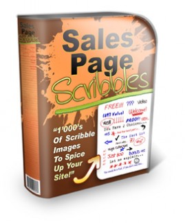
So what are these sales page scribbles? I'm sure you've seen them before. What they are is basically simple shapes and text that look like they were hand written or hand drawn by someone into the sales page. They make the sales letter look more personal.
Why is that important for you?
Most of the big name gurus use them in their sales letters, and for good reason. These scribbles actually increase conversions. And we all want better conversions, don't we?
The fact is, a sales page with just plain text is boring. Nobody wants to read a big block of text. I'm sure you've heard this before. What you need to do is...
You need to break up your sales copy into easy to read chunks.
You need to add sub headlines throughout the page for people that like to skim through the sales letter.
You need to highlight, bold, underline, and basically emphasize important text to make it stand out.
You need to add simple images like arrows, graphs, bullets, screenshots, photos, etc., to make the sales letter more interesting and engaging. (Again, no one wants to look at plain text for half an hour)
And you need to make your sales copy more personal, as if you're writing to a friend, one on one, in a conversational tone.
Of course there is a lot more to a good sales letter than that, but all of these little things increase conversions. And you can do all of the above with these "scibble" images. Instead of a sales letter with plain text, you can make it look as if you've written on the page yourself, with your own handwriting. Sort of like writing a note to your friend. And this makes a BIG impact.
Here's the deal, after looking over dozens of sales letters for all the popular and successful products, I created a "swipe file" of all the most used phrases and images on those sites. And then I created my own versions of all those items, in "scribble" form. And what I've come up with is......


